How To Add Dark Mode To Your Gridsome Blog With Tailwind CSS V2 [2021 Guide]
 Photo by Austin Neill on Unsplash
This is part eleven of a series on building a file-based blog from scratch with Gridsome. Find the full series here.
UI is finally moving to dark mode. More and more websites allow users to select a dark theme. MacOS, iOS, many apps, and even Windows 10 have dark mode.
At the end of this article, you will know how to add dark mode to your Gridsome website with Tailwind CSS V2.
The end result will look like this:
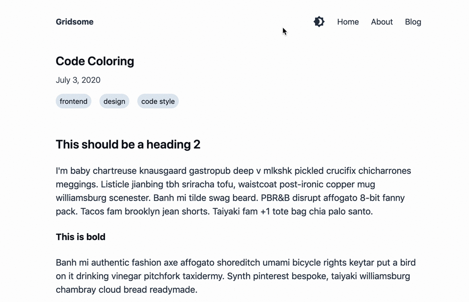
Let's find out how to build this!
TailwindCSS now offers a native dark mode since V2! I've updated this blog post accordingly. If you need to build dark mode with V1, you can find the old version with tailwind V1 here.
How to use dark mode with Tailwind CSS
We configure our Tailwind CSS with the tailwind.config.js.
Our method of choice is to enable dark mode in the class mode, which means that dark mode will be enabled on all the child elements of an element that uses
TailwindCSS now offers a tailwind-native dark mode since V2!
module.exports = {
  purge: {
    enabled: false
  },
  darkMode: 'class',
  variants: {},
  plugins: []
}
Let’s build a toggle so the user can switch the theme in the nav bar.
Add Dark Variant to TailwindCSS Typography Plugin
Tailwind typography sets dark text colors. To add a light version we'll add a new modifier (GitHub comment by Adam Wathan). Extend your tailwind.config.js like this:
module.exports = {
  purge: {
    content: [
      './src/**/*.vue',
      './src/**/*.js',
      './src/**/*.jsx',
      './src/**/*.html',
      './src/**/*.pug',
      './src/**/*.md'
    ]
  },
  darkMode: 'class',
  theme: { // extend the typography plugin with a `light` variant
    extend: {
      typography: (theme) => ({
        light: {
          css: [
            {
              color: theme('colors.gray.300'),
              '[class~="lead"]': {
                color: theme('colors.gray.300')
              },
              a: {
                color: theme('colors.gray.100')
              },
              strong: {
                color: theme('colors.gray.100')
              },
              'ol > li::before': {
                color: theme('colors.gray.400')
              },
              'ul > li::before': {
                backgroundColor: theme('colors.gray.600')
              },
              hr: {
                borderColor: theme('colors.gray.200')
              },
              blockquote: {
                color: theme('colors.gray.200'),
                borderLeftColor: theme('colors.gray.600')
              },
              h1: {
                color: theme('colors.gray.100')
              },
              h2: {
                color: theme('colors.gray.100')
              },
              h3: {
                color: theme('colors.gray.100')
              },
              h4: {
                color: theme('colors.gray.100')
              },
              'figure figcaption': {
                color: theme('colors.gray.400')
              },
              code: {
                color: theme('colors.gray.100')
              },
              'a code': {
                color: theme('colors.gray.100')
              },
              pre: {
                color: theme('colors.gray.200'),
                backgroundColor: theme('colors.gray.800')
              },
              thead: {
                color: theme('colors.gray.100'),
                borderBottomColor: theme('colors.gray.400')
              },
              'tbody tr': {
                borderBottomColor: theme('colors.gray.600')
              }
            }
          ]
        }
      })
    }
  },
  variants: {
    extend: {
      typography: ['dark']
    }
  },
  plugins: [
    require('@tailwindcss/typography')
  ]
}
Add a theme-switcher
At first we need to add some icons we can use.
The material icon set is open source, so let’s install their Vue bindings: yarn add vue-material-design-icons.
Now, create a file called src/components/ThemeSwitcher.vue with the following contents:
<template>
  <a
    href="#"
    class="text-gray-700 dark:text-gray-300 hover:text-gray-900 dark:hover:text-gray-100"
    title="Toggle theme between light and dark"
    aria-label="Toggle theme between light and dark"
    @click.prevent="toggleTheme"
  >
    <Brightness4 v-if="theme === 'light'" />
    <Brightness7 v-else />
  </a>
</template>

<script>
import Brightness4 from 'vue-material-design-icons/Brightness4'
import Brightness7 from 'vue-material-design-icons/Brightness7'

export default {
  components: {
    Brightness4,
    Brightness7
  },
  data () {
    return {
      theme: ''
    }
  },
  mounted () {
    const userPrefersDark = window.matchMedia && window.matchMedia('(prefers-color-scheme: dark)').matches
    const defaultTheme = userPrefersDark ? 'dark' : 'light'
    const theme = localStorage.getItem('theme') || defaultTheme
    this.setTheme(theme)
  },
  methods: {
    toggleTheme () {
      const newTheme = this.theme === 'light' ? 'dark' : 'light'
      this.setTheme(newTheme)
    },
    setTheme (newTheme) {
      this.theme = newTheme
      if (this.theme === 'dark') {
        document.documentElement.classList.add('dark')
      } else {
        document.documentElement.classList.remove('dark')
      }
      localStorage.setItem('theme', newTheme)
    }
  }
}
</script>
We add a simple a element that renders either the Brightness4 or the Brightness7 icon.
That a element calls the toggleTheme method when clicked, which changes the local theme variable adds or removes the dark class from the document body.
This component remembers the user's settings with localStorage.
It even loads the user’s preferred theme via the window.matchMedia('(prefers-color-scheme: dark)').matches media query.
Now we integrate this theme component into our default layout:
<template>
  <div
    class="min-h-screen flex flex-col bg-white dark:bg-gray-800 text-gray-700 dark:text-gray-300 transition-colors delay-100 ease-linear"
    :class="this.theme"
  >
    <div class="container max-w-screen-md mx-auto px-5">
      <header class="flex justify-between items-center mt-8 mb-12">
        <strong>
          <g-link to="/">{{ $static.metadata.siteName }}</g-link>
        </strong>
        <nav class="flex">
          <!-- Add the theme switcher here -->
          <theme-switcher />
          <g-link
            class="ml-6"
            to="/"
          >
            Home
          </g-link>
          <g-link
            class="ml-6"
            to="/about/"
          >
            About
          </g-link>
          <g-link
            class="ml-6"
            to="/blog/"
          >
            Blog
          </g-link>
        </nav>
      </header>
      <slot />
    </div>
  </div>
</template>

<static-query>
query {
  metadata {
    siteName
  }
}
</static-query>

<script>
// import the theme-switcher here
import ThemeSwitcher from '../components/ThemeSwitcher'

// reguster theme-swticher under components
export default {
  components: {
    ThemeSwitcher
  }
}
</script>
The theme switcher component is now in our nav bar.
Let’s add the dark:* tailwind classes so our dark mode finally works.
Integrate the theme into your Gridsome Site
If you follow my Gridsome tutorial, let's add text-2xl text-gray-900 dark:text-gray-100 to all of our h1 tags for consistency.
You define the dark theme on your Gridsome site with dark:* variants of the color classes.
Let's start with our BlogPost.vue template:
<template>
  <Layout>
    <h1 class="mb-2 text-2xl font-semibold text-gray-900 dark:text-gray-200">
      {{ $page.post.title }}
    </h1>
    <p class="mb-4 font-light text-gray-700 dark:text-gray-400">
      {{ $page.post.date }}
    </p>
    <div class="flex flex-wrap mb-4 text-sm">
      <g-link
        v-for="tag in $page.post.tags"
        :key="tag.id"
        :to="tag.path"
        class="px-2 py-1 mb-4 mr-4 rounded-full bg-gray-300 dark:bg-gray-700 text-gray-700 dark:text-gray-300 hover:text-gray-300 hover:bg-gray-700 dark:hover:text-gray-700 dark:hover:bg-gray-300"
      >
        {{ tag.title }}
      </g-link>
    </div>
    <figure
      v-if="$page.post.image"
      class="flex flex-col"
    >
      <g-image
        :alt="$page.post.image.alt"
        :src="$page.post.image.path"
        class="mb-2"
      />
      <figcaption
        class="self-center mb-10 image-caption"
        v-html="$page.post.image.caption"
      />
    </figure>
    <div
      class="mb-16 prose dark:prose-light lg:prose-lg xl:prose-xl"
    >
      <VueRemarkContent />
    </div>
  </Layout>
</template>
Now, we need to change our default.vue layout:
<template>
<div
class="min-h-screen flex flex-col bg-white dark:bg-gray-800 text-gray-700 dark:text-gray-200 transition-colors delay-100 ease-linear"
>
<div class="container max-w-screen-md mx-auto px-5">
<header class="flex justify-between items-center mt-8 mb-12">
<strong>
<g-link to="/">{{ $static.metadata.siteName }}</g-link>
</strong>
<nav class="flex">
<theme-switcher />
<g-link
class="ml-6"
to="/"
>
Home
</g-link>
<g-link
class="ml-6"
to="/about/"
>
About
</g-link>
<g-link
class="ml-6"
to="/blog/"
>
Blog
</g-link>
</nav>
</header>
<slot />
</div>
</div>
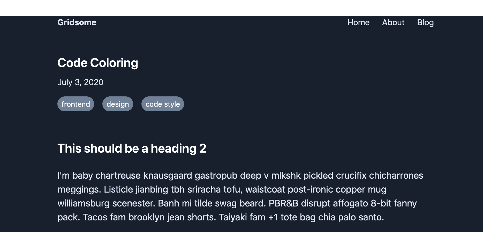
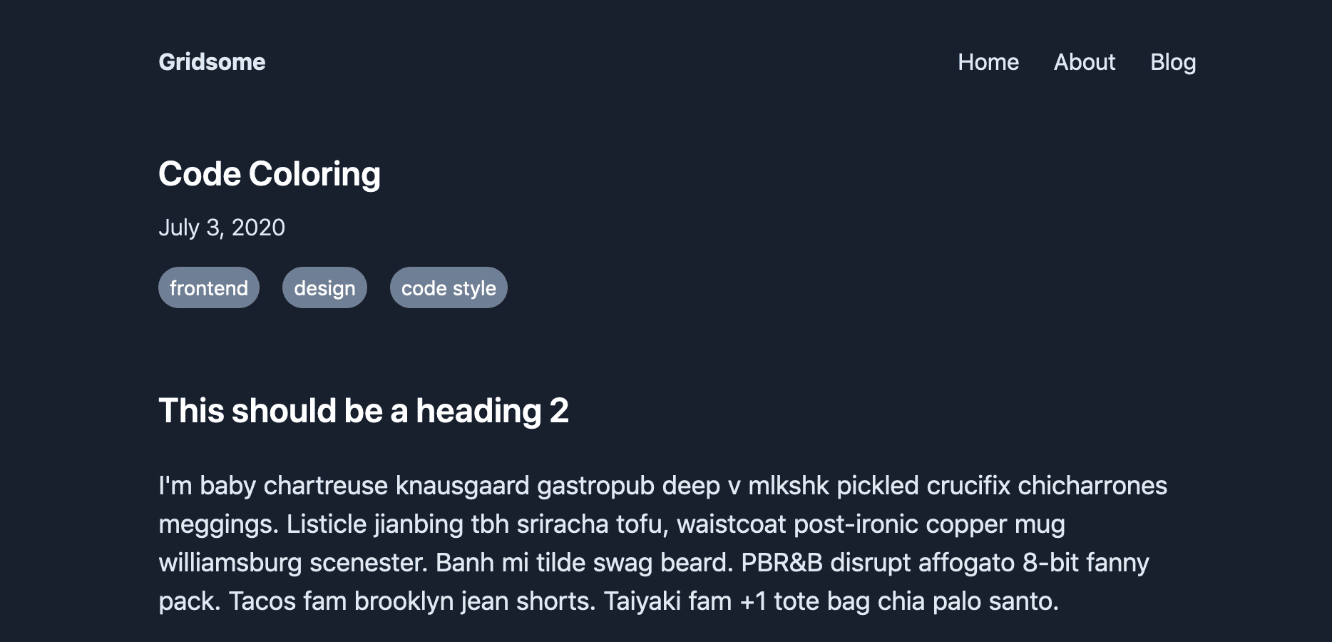
</template>Okay. Now we should be able to toggle the dark mode, and the whole site is dark!
Oh! One more bug to fix. For the nav items to be fully included in our wrapper, we need to add flex flex-col to the wrapper’s classes.
So what happened?
We have added a wrapper around our site at the highest level. This wrapper ensures that our background color always spans the whole site.
Now dark mode looks good, too:
Next part: SEO guide for Gridsome
That’s it for this post on how to add dark mode support to our Gridsome blog with Tailwind CSS. In the next part of this series, we improve SEO for our blog.