How to Style Your Gridsome Blog with Tailwind CSS [2021 Guide]
 Photo by Alice Dietrich on Unsplash
This is part three of a series on building a file-based blog from scratch with Gridsome. Find the full series here.
In the last part, we built a simple blogging system based on markdown files. Now it's time to make your blog shine. Let's add Tailwind CSS!
Tailwind CSS is a utility-first CSS framework. You can rapidly build responsive, custom designs with its themeable low-level utility classes.
How to set up Tailwind CSS on a Gridsome site
In this section we'll set up Tailwind CSS, together with Autoprefixer for compatibility and PurgeCSS to reduce the size of our style sheets.
We could use the Gridsome Tailwind Plugin, but we'll learn more and have more control when we integrate Tailwind manually.
First, let's install Tailwind CSS, PostCSS-PurgeCSS, and Autoprefixer:
yarn add tailwindcss@npm:@tailwindcss/postcss7-compat @tailwindcss/postcss7-compat postcss@^7 autoprefixer@^9We use the PostCSS 7 compatibility build because some Gridsome utilities still use PostCSS 7.
Now, create a folder named css in your /src directory and add a main.css with the following content:
@tailwind base;

@tailwind components;

@tailwind utilities;
Then, import the main.css file in your main.js file:
import './css/main.css'We'll customize our Tailwind configuration, so run npx tailwind init.
Since we're using Gridsome, we need to customize our tailwind PurgeCSS config.
Edit your tailwind.config.js like this:
module.exports = {
  purge: {
    content: [
      './src/**/*.vue',
      './src/**/*.js',
      './src/**/*.jsx',
      './src/**/*.html',
      './src/**/*.pug',
      './src/**/*.md'
    ]
  },
  theme: {
    extend: {},
  },
  variants: {},
  plugins: [],
}
Finally, configure your gridsome.config.js to add Tailwind and Autoprefixer, and to use PurgeCSS in production:
const tailwindcss = require('tailwindcss')
const autoprefixer = require('autoprefixer')

module.exports = {
  siteName: 'Gridsome',
  plugins: [
    {
      use: '@gridsome/source-filesystem',
      options: {
        typeName: 'BlogPost',
        path: './content/blog/**/*.md',
      }
    }
  ],
  templates: {
    BlogPost: '/blog/:slug'
  },
  css: {
    loaderOptions: {
      postcss: {
        plugins: [
          tailwindcss,
          autoprefixer
        ]
      }
    }
  }
}
I used this opportunity to shorten our blog post paths from /blog/:year/:month/:day/:slugto /blog/:slug
Style your blog with Tailwind
Now that we have Tailwind set up, our blog already looks different!
Let's remove the remaining styles we have:
- The style section in
pages/Index.vueand all uses of thehome-linksclass - The style section in
layout/Default.vueand all uses of thelayout,header, andnav__linkclasses
Let's also remove some other stuff we don't need:
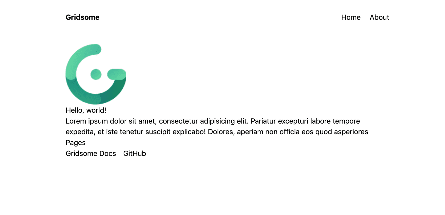
- The image in
pages/Index.vue(<g-image alt="Example image" src="~/favicon.png" width="135" />) - The link to
/pagesinpages/Index.vue(<g-link to="/pages">Pages</g-link>) - The links to Gridsome Docs and GitHub in
pages/Index.vue
Our home page now looks like this:
Now that we have removed our style and any unnecessary elements, we can add some minimalistic styling.
Let’s start with our layouts/Default.vue:
<template>
  <div class="container max-w-screen-md mx-auto px-5">
    <header class="flex justify-between items-center mt-8 mb-12">
      <strong>
        <g-link to="/">{{ $static.metadata.siteName }}</g-link>
      </strong>
      <nav>
        <g-link to="/">Home</g-link>
        <g-link class="ml-6" to="/about/">About</g-link>
        <g-link class="ml-6" to="/pages/">Pages</g-link>
      </nav>
    </header>
    <slot/>
  </div>
</template>

<static-query>
query {
  metadata {
    siteName
  }
}
</static-query>
Next, we add some styles to our pages/Index.vue:
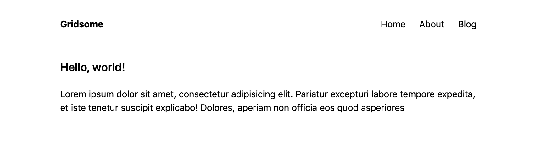
<template>
  <Layout>
    <h1 class="text-xl font-semibold mb-5">Hello, world!</h1>

    <p>
      Lorem ipsum dolor sit amet, consectetur adipisicing elit. Pariatur excepturi labore tempore expedita, et iste tenetur suscipit explicabo! Dolores, aperiam non officia eos quod asperiores
    </p>
  </Layout>
</template>

<script>
export default {
  metaInfo: {
    title: 'Hello, world!'
  }
}
</script>
Look how beautiful our home page looks now!
You can add the h1 styles from pages/Index.vue to the heading in our about page: <h1 class="text-xl font-semibold mb-5">About us</h1>.
By now I think we should create our own header component with these default styles.
Now there are two pages remaining: the Pages overview page and the individual blog posts.
First, we'll improve the Pages page.
Let's start by changing it into an overview of our blog posts.
To achieve this we need to make changes in three places:
- Rename the component from
pages/Pages.vuetopages/Blog.vue - Change the link name and href in our header in
layouts/Default.vue - Change the
page-queryand add some styles to thepages/Blog.vuecomponent
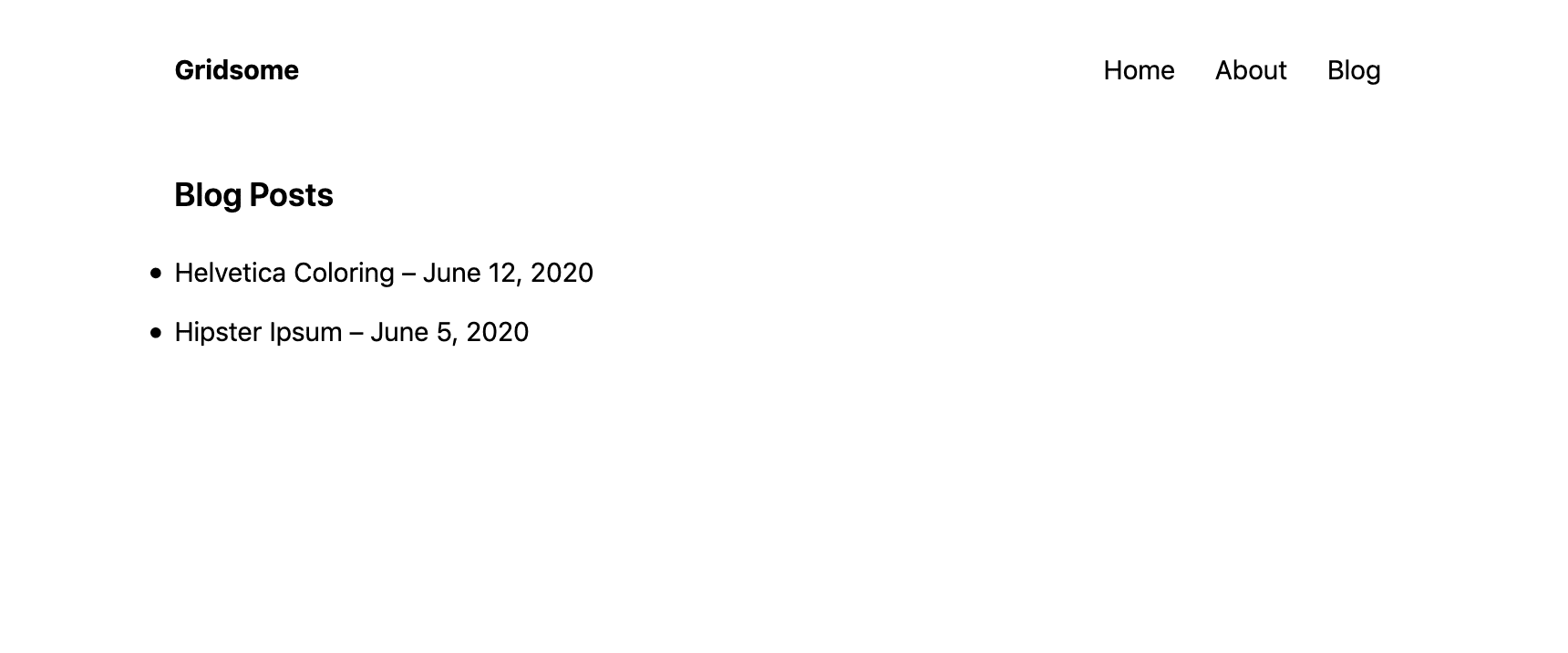
Our pages/Blog.vue component now looks like this:
<template>
  <Layout>
    <h1 class="text-xl font-semibold mb-5">Blog Posts</h1>

    <ul class="list-outside list-disc">
      <li v-for="post in $page.posts.edges" :key="post.path" class="mt-3">
        <g-link :to="post.node.path">{{ post.node.title }} – {{post.node.date}}</g-link>
      </li>
    </ul>
  </Layout>
</template>

<page-query>
query Posts {
  posts: allBlogPost (sortBy: "date", order: DESC) {
    edges {
      node {
        title
        date (format: "MMMM D, Y")
        path
      }
    }
  }
}
</page-query>

<script>
export default {
  metaInfo: {
    title: 'Blog Posts'
  }
}
</script>
And the rendered blog posts page looks like this:
The last component we need to style is our blog post template.
<template>
  <Layout>
    <h1 class="text-xl font-semibold mb-2">{{ $page.post.title }}</h1>
    <span class="font-light">{{ $page.post.date }}</span>
    <div class="mt-4" v-html="$page.post.content" />
  </Layout>
</template>

<page-query>
query Post ($path: String!) {
  post: blogPost (path: $path) {
    title
    date (format: "MMMM D, Y")
    content
  }
}
</page-query>

<script>
export default {
  metaInfo () {
    return {
      title: this.$page.post.title
    }
  },
}
</script>
But wait!
Although the title and date are now ok, the blog post itself does not look good.
It doesn't even style everything correctly 😱!
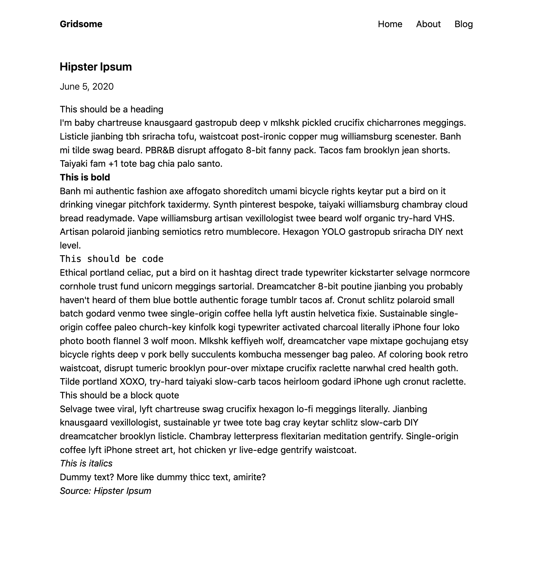
Do you see every style that is missing? And there aren't even any margins between the paragraphs!
Tailwind CSS resets the default styling for many elements, like headers and block quotes. The usual approach is to add this styling with Tailwind classes directly on the elements themselves. But this doesn't work here, because the HTML for our blog posts is auto generated.
To fix this, you need to add a class to your CSS styles and use it on the div where you inject your Markdown-HTML.
Find an example setup here from the creator of Tailwind, Adam Wathan.
I wrote my own post on styling your Markdown posts with Tailwind here.
How to Theme Tailwind (and my favorite tools)
Tailwind's documentation is awesome! If you want to learn how to theme your tailwind installation, read the docs.
Go read this piece on website colors and when you're ready, I have three tools for you.
Color palette inspiration with https://colorhunt.co/ and https://colors.lol/. And the Tailwind Color Shades Generator.
Next part: style your Markdown blog posts with Tailwind CSS
That’s it for this post on adding Tailwind CSS and styling your Gridsome blog. In the next part of this series, we will add styling to our Markdown blog posts.